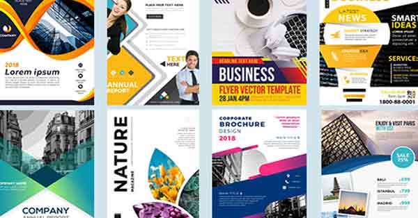
How To Design a Powerful Email Flyer?
There’s a wonderful feeling to designing something, then having it printed and feeling it in your hands. This is one reason flyer design can be rewarding and a lot of fun
- Keep your content brief
- Divide your copy into digestible sections
- Use bullet points and infographics
- Create a attractive headlines
- Add a call-to-action
- Don’t forget to add directions
- Include your contact information
- Always proofread and spell check your content
Your email marketing flyer design should help the viewer know what they should check out first, and what can they get from it. They should be able to go through the email fast using a logical hierarchy with large headlines, signs and images focusing the attention. Use the design to break up space and help create eye catching flyer.
One column emails flyers work great on desktops and mobiles. These mobile first emails usually adapt to desktop and scale images. It helps viewers navigate the email without troubling them. The one column design makes it obvious what information is important and what you want a consumer to do next.
Also the flyer should view in both mobile and desktops clearly. Specially on mobile devices it should view in few deferment screen sizes.
How To Design a Powerful Email Flyer?


Leave a Reply